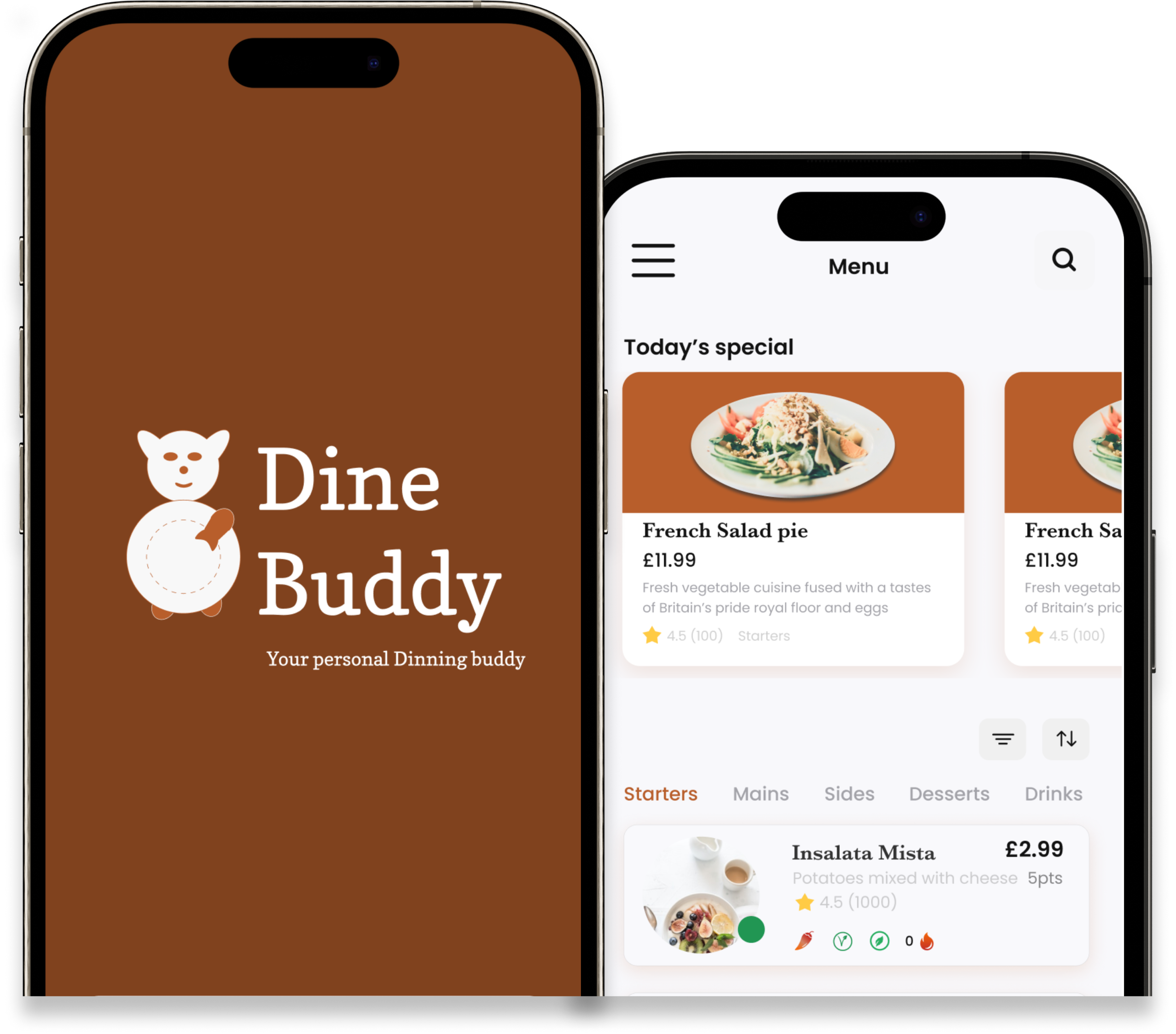
DineBuddy - March 2023

Creating an inclusive dietary recommender for people with dietary needs dining at restaurants

Role: UX Designer                    Duration: 3 months                    Output: Mobile app

Industry: Dining                         Location: London                         Services provided: Dietary guidance and approval

DINEBUDDY

Dining service

BACKGROUND

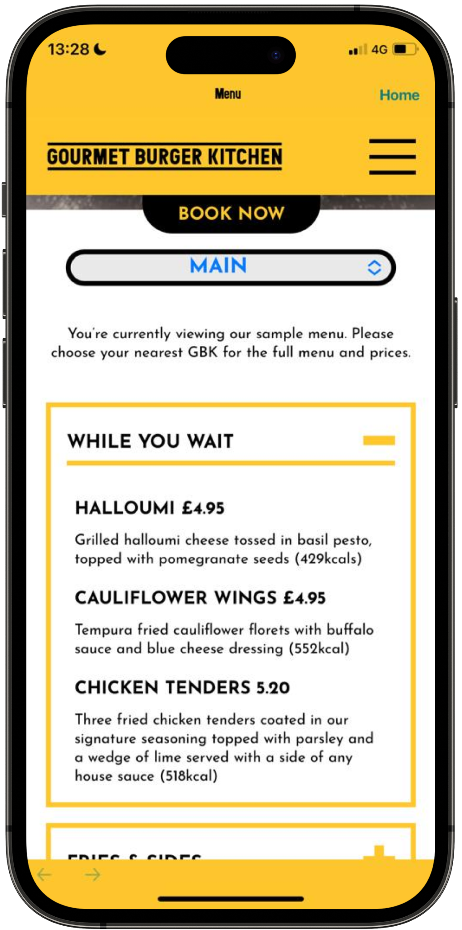
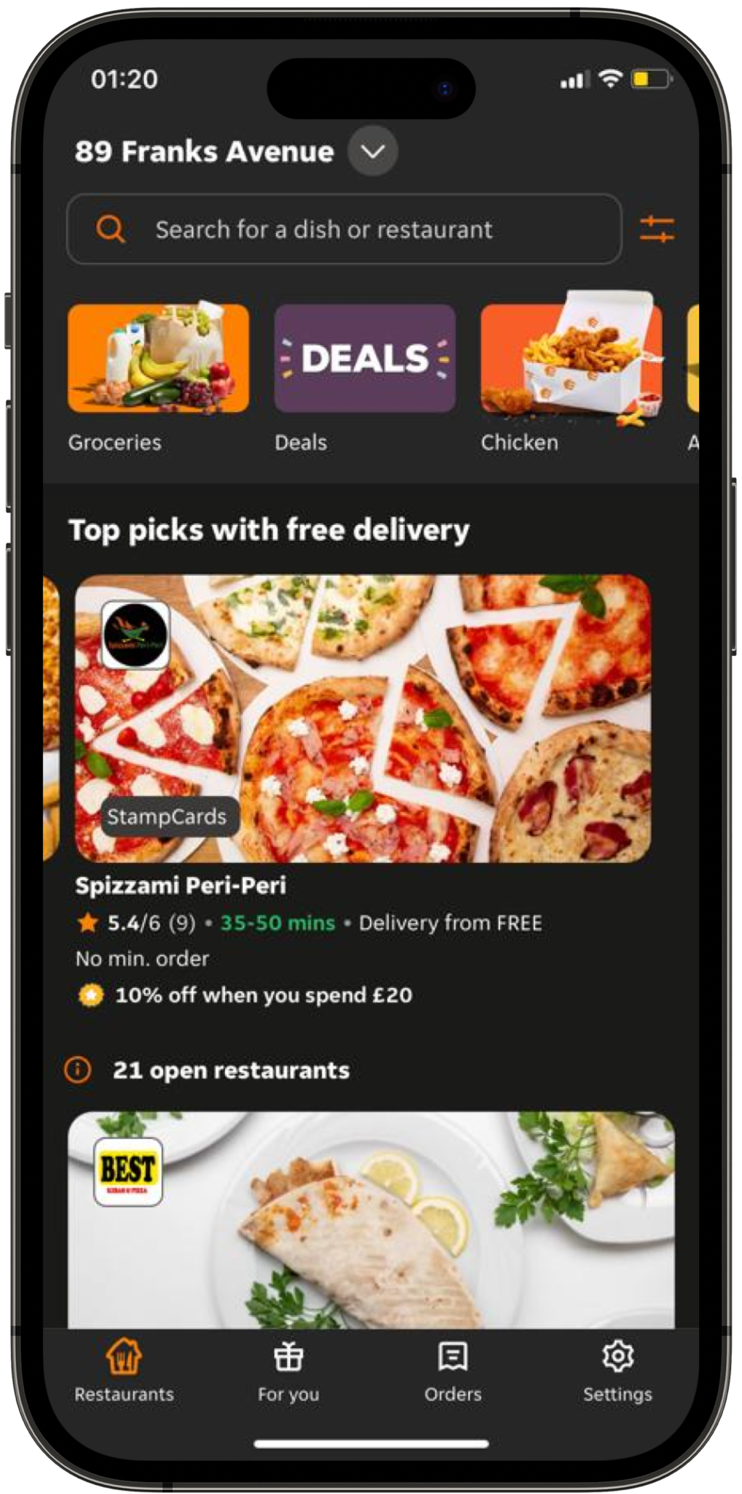
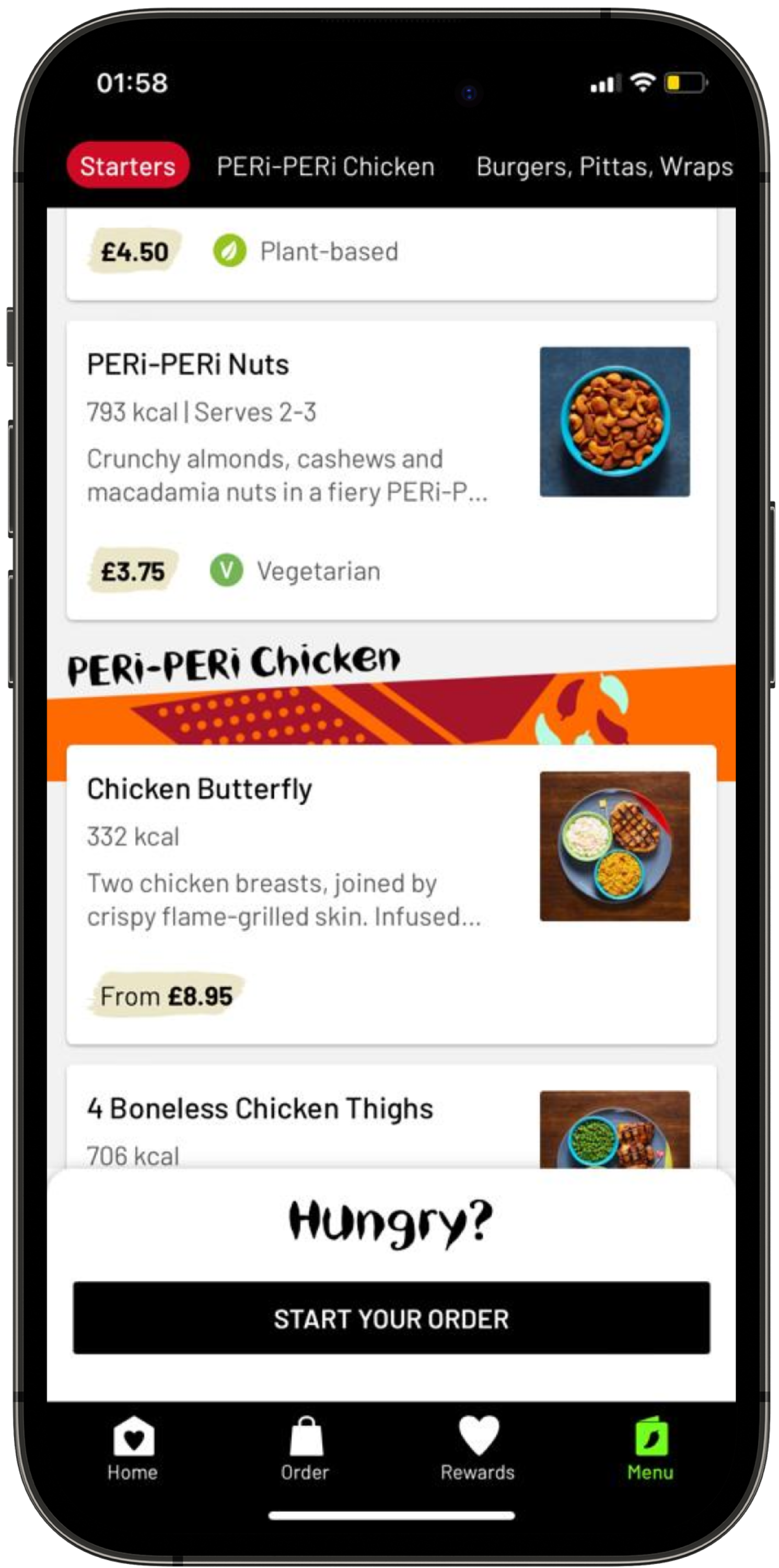
The company aimed to enhance the dining experience by creating a smart mobile app with features that offer personalized dietary recommendations and dining experiences. Some of the features included:

Allergen specification
Custom dietary options
Menu-based suggestions
CHALLENGE
Enhance restaurant dining with a mobile app for unique customer experiences. Enable bespoke menu-based meal recommendations (with insights) and ordering experience for customers.
OUTCOME
We designed a mobile app that seamlessly integrated features such as allergen specifications, custom dietary options, and menu-based recommendations, while also establishing a comprehensive design system.

RESEARCH

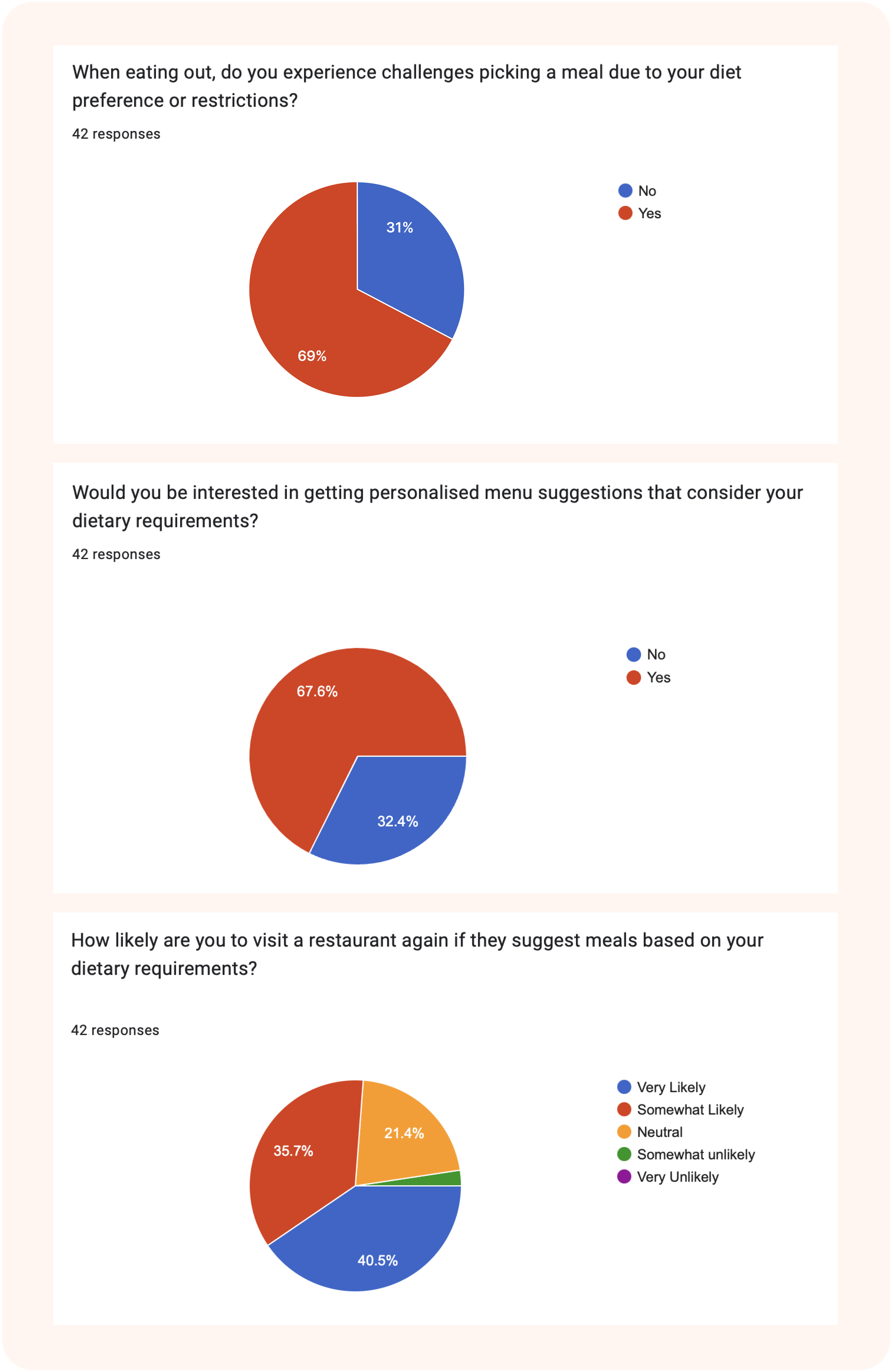
We initiated our research by investigating the effectiveness of restaurant apps in enhancing personalized dining experiences. To do so, we designed an online survey to gauge users' experiences, expectations, and pain points when using such apps. Here, we highlight key insights obtained from our research:

  • More than half of the people  experience challenges picking meals due to their dietary preference/restrictions
  • Displaying allergens and sustainability information are very important
  • Customers demand customised food recommendation based on their allergens
  • A restaurant's sustainability may influence someone's decision to dine there
  • Diners want to provide direct feedback to waiters  and chefs
  • People are willing to use a restaurant app   integrated with a dietary planning app

WORKSHOP AND IDEATION

We used survey data and competitive analysis to shape brainstorming sessions, focusing on creating a simple platform with unique value. I led an online brainstorming session with a designer, product manager, and CTO, mainly discussing design interactions, data for analysis, and the presentation of recommended results to ensure design simplicity.

GBK
JUST EAT
NANDO’S
  • User receive non-personalised recommendation on meals
  • Users can order meals easily with and excellent display of content
  • The app is connected with third party apps
  • Navigation difficulties due to absence of a nav bar
  • The app needs white spacing
  • There is no opportunity for users to specify dietary needs

  • User receive non-personalised recommendation on meals
  • The search results on food items is displayed very well
  • The meal sort feature is excellent for decision making
  • The app contains too much information per screen
  • Information overload on screens and overlapping visual contents
  • There is no opportunity for users to specify dietary needs
  • Menu categories placed too high on the app
  • User receive non-personalised recommendation on meals
  • It contains excellent display of warning about meal choices
GBK
  • User receive non-personalised recommendation on meals
  • Users can order meals easily with and excellent display of content
  • The app is connected with third party apps
  • Navigation difficulties due to absence of a nav bar
  • The app needs white spacing
JUST EAT
  • There is no opportunity for users to specify dietary needs

  • User receive non-personalised recommendation on meals
  • The search results on food items is displayed very well
  • The meal sort feature is excellent for decision making
  • The app contains too much information per screen
NANDO’S
  • Information overload on screens and overlapping visual contents
  • There is no opportunity for users to specify dietary needs
  • Menu categories placed too high on the app
  • User receive non-personalised recommendation on meals
  • It contains excellent display of warning about meal choices

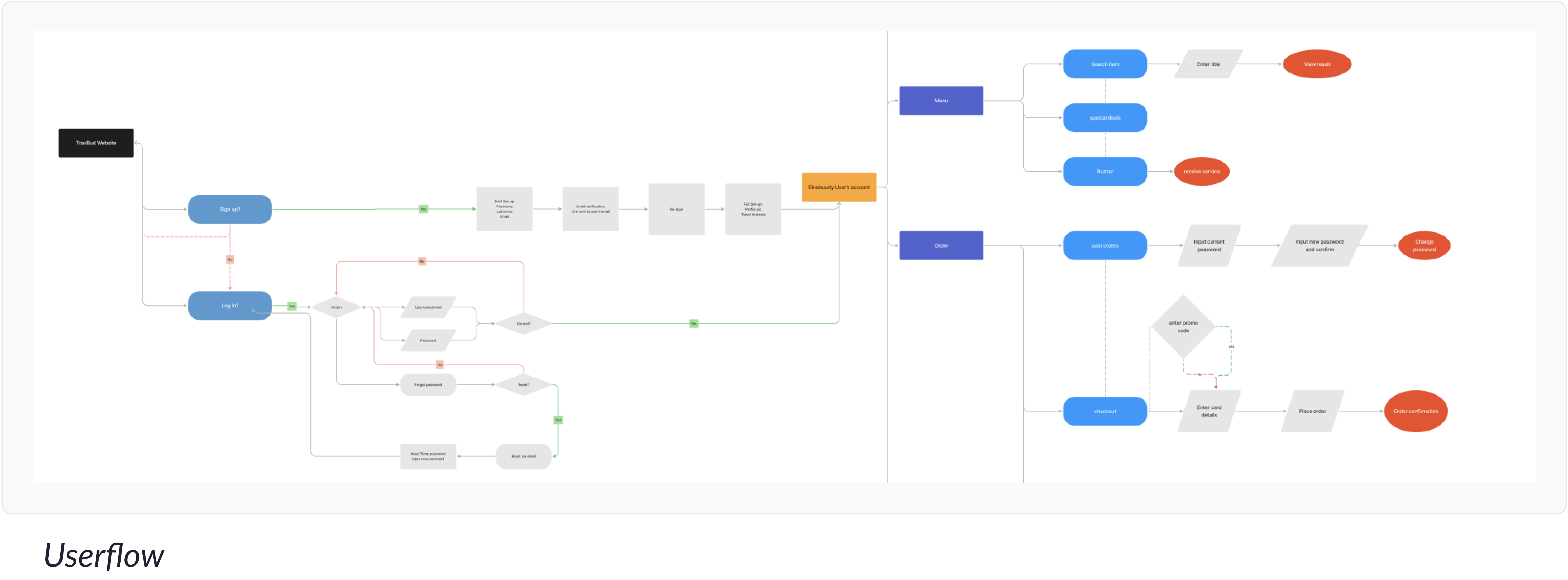
The designs born out of our brainstorming sessions served as the foundation for crafting user stories, outlining the various actions users could take within the application. We then developed information architecture and user flows for the primary pathways, ensuring that users could navigate the system effectively

SOLUTIONS DESIGNED

We began the process by creating multiple versions of important screens. After gathering feedback from the CTO and product manager, we selected one of these versions

First, we drew various design styles for specific screens, recognizing that we might have unique perspectives on screens such as the login screen. These design options laid the foundation for our overall design language, covering aspects like form fields, buttons, and the general appearance.

After the sketches, we proceeded to develop low-fidelity wireframes for the initially sketched screens and integrated these wireframes into the flow sequence. This step guaranteed the inclusion of all necessary screens in the processes.

HIGH FIDELITY DESIGN

To create high-fidelity designs, we followed atomic design principles, using brand elements for consistency. We iterated based on testing and feedback, developing a robust design system with atoms, molecules, and organisms in Figma

After the sketches, we proceeded to develop low-fidelity wireframes for the initially sketched screens and integrated these wireframes into the flow sequence. This step guaranteed the inclusion of all necessary screens in the processes.

CONCLUSIONS

Key findings

  • Testers understood and endorsed the traffic light system used to offer dietary recommendations
  • 5 people said the recommendation insights display would make the app stand out
  • 2 out of 9 testers expressed their concerns for more need for information on the app but they were happy to still try it out

Next Steps

We plan to complete the design system and finalize the Dinebuddy mobile app by the end of Q4 2023. Afterward, we will implement the design system in both the Diners' and hospitality staff's applications for the brand